Until I land a UX gig, I still work as a real-estate appraiser, which involves lots of driving all over Metro Atlanta. I use Google Maps quite frequently both on the web and on my Android, so I was intrigued when I saw a post on the Humans in Design blog that linked to a fascinating study by Justin O’Beirne on why Google Maps are much more readable than Bing or Yahoo Maps.
Below is an animated GIF comparison of the same section of the Northeast United States as seen on Google Maps and Bing Maps. The difference in clarity and legibility is quite pronounced.
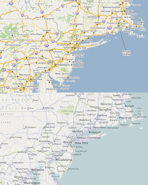
O’Bierne originally hypothesized that the Bing and Yahoo! maps appeared to be more cluttered because Google had a lower label density, and that the extra labels used by the other sites created more “noise” that hampered readability.
Once he did some research however he discovered that Google’s label density is similar to both Bing & Yahoo!. The main legibility difference was not label density but instead seemed to based on a couple of visual and textual effects. Those effects include:
White Outlines to Obscure Background Data
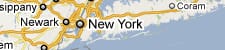
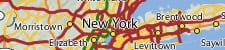
Google realized that blocking out the details behind the city name greatly increased the legibility of the text without negatively impacting the efficacy or accuracy of the map. The added “noise” of the information behind the text in the Yahoo! map makes it much more difficult to read. (see screen caps below)
A Greater Number/Diversity of Label Classes
Google also uses slightly more classes of city labels than Bing or Yahoo!. The extra level of hierarchy doesn’t clutter the design, it actually makes smaller cities fade into the background and presents major cities, which are often used as reference points by the user, much more prominently.
Different Label Shadings
In addition to using more classes of city labels, Google also uses a larger range of colors and sized for the different classes of city labels. There are four levels of color, size and font-size with larger metropolitan areas being much heavier and darker with each subsequent class gets lighter and smaller. The lighter, smaller 4th class of cities makes it easier for them to fade into the background.
Label “De-cluttering” Outside Metropolitan Areas

This is my favorite I think. Google appears to have “erased” or significantly de-emphasized smaller cities just outside of major metropolitan centers. The extra white-space makes it much easier to locate major cities, thereby making it easier for the user to use those cities as reference points for their navigation.
Wrapping It Up
I have never used Bing maps but I did migrate from Yahoo! maps to Google maps a few years ago. At the time the move was based on what I perceived as Google superior accuracy and not on legibility or ease-of-use. At least I think it was…because after seeing this analysis there was probably a subconscious appreciation for how much easier Google Maps were to use and understand.
Without discounting the testing and work it took for folks to develop and implement these techniques at Google, I love how seemingly simple and obvious they are. I mean “Text over a patterned background is difficult to read“, “establish a clear visual hierarchy of important data” and “use white space to highlight important information” aren’t really novel concepts. Which makes it even more disappointing that Bing and Yahoo! either didn’t care or didn’t spend much time thinking about the individuals who would be using their product.
UPDATE
Justin O’Beirne posted an update to his original post; the update includes a comprehensive breakdown of how Google’s use of labels significantly increases the legibility of Google Maps.
Links