Google Map Legibility
Until I land a UX gig, I still work as a real-estate appraiser, which involves lots of driving all over Metro Atlanta. I use Google Maps quite frequently both on the web and on my Android, so I was intrigued when I saw a post on the Humans in Design blog that linked to a fascinating study by Justin O’Beirne on why Google Maps are much more readable than Bing or Yahoo Maps.
Below is an animated GIF comparison of the same section of the Northeast United States as seen on Google Maps and Bing Maps. The difference in clarity and legibility is quite pronounced.
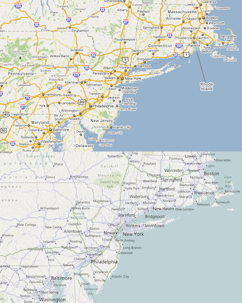
O’Bierne originally hypothesized that the Bing and Yahoo! maps appeared to be more cluttered because Google had a lower label density, and that the extra labels used by the other sites created more “noise” that hampered readability.
Once he did some research however he discovered that Google’s label density is similar to both Bing & Yahoo!. The main legibility difference was not label density but instead seemed to based on a couple of visual and textual effects. Those effects include: