mobile moment, mobile first
Not that “mobile” was in any danger of fading away, but I’m excited that the next two CHI Atlanta events are mobile focused, first with Coleen Jones’ “Mobile Moment” this Thursday May 19th, and then…
Not that “mobile” was in any danger of fading away, but I’m excited that the next two CHI Atlanta events are mobile focused, first with Coleen Jones’ “Mobile Moment” this Thursday May 19th, and then…
Just saw a post on Paul Irish’s Blog explaining the “protocol relative URL”, which appears to be a great way to eliminate this confusing (or possibly even scary for some) error message in IE: “This…
When I was 15 or so I bought an album by the band Cargo Cult on the recommendation of a friend. I didn’t know what the band name meant, and since this was assuredly pre-Google, I…
Jared Spool explains how to build a crappy survey that will produce suspect, if not misleading, results. And that’s in addition to frustrat ing/alienating your users/customers, which is never a good idea. Links Jared Spool…
Until I land a UX gig, I still work as a real-estate appraiser, which involves lots of driving all over Metro Atlanta. I use Google Maps quite frequently both on the web and on my Android, so I was intrigued when I saw a post on the Humans in Design blog that linked to a fascinating study by Justin O’Beirne on why Google Maps are much more readable than Bing or Yahoo Maps.
Below is an animated GIF comparison of the same section of the Northeast United States as seen on Google Maps and Bing Maps. The difference in clarity and legibility is quite pronounced.

O’Bierne originally hypothesized that the Bing and Yahoo! maps appeared to be more cluttered because Google had a lower label density, and that the extra labels used by the other sites created more “noise” that hampered readability.
Once he did some research however he discovered that Google’s label density is similar to both Bing & Yahoo!. The main legibility difference was not label density but instead seemed to based on a couple of visual and textual effects. Those effects include:
A discussion of a quick, collaborative and inexpensive way to prototype: sketchboarding. Includes links to various sketchboarding resources.
While a lot of bad interface design can be blamed on ‘not knowing any better’, there is also a more sinister form of bad design called “dark patterns” in which case bad design can be blamed on malfeasance; the interface is explicitly designed to confuse and/or trick the user.
These “dark patterns” were new to me (I first saw mention of them a few weeks ago via a tweet from @willsansbury that linked to a summary of Aaron Walters’ Interface Design Bootcamp, and Mr. Walter’s post included a link to the Dark Patterns Wiki) but the concept of consciously using psychology & UX methodology to mislead the user was unexpected and quite intriguing.
Then the next day my friend and awesome-UX guru Tyesha Snow posted Dark Pattern: Now You See it Now You Don’t on her blog. Two days two mentions of dark patterns; suddenly it was all up in my face and I wanted to know more.
There are, of course, several ways to define exactly what dark patterns are but Tyesha did a great job of boiling exactly what a dark pattern is so I’ll share hers here:
and then she uses an example of trying to “Unlike” a business that you’ve previously “Liked” on Facebook, and how incredibly tedious and convoluted that process is. Sensitive to how ugly a big UNLIKE button would be she provides
While doing some contact-form redesign for a friend/colleague I noticed that a the majority of the sites he wanted me to work on were, um, severely cramped and top heavy with very limited white-space.
He explained that his boss was adamant that everything needed to be above the fold, so he was forced to “squeeze” the design to insure that everything was visible above ~700 pixels.
Simply packing tons of information and functionality with little or no white-space or context didn’t seem to be the best solution to the “fold problem”.
I found a few illuminating articles that, in very general terms, agree that:
I’m not completely convinced yet, but UK based cx partners declare that, based on the results of over 800 user test results, the page fold is a myth. They claim that only 3 times in 800 tests did the page fold barrier prevent users from getting the content they were looking for.
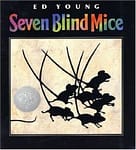
My daughter has a book by Ed Young called Seven Blind Mice that retells an old Indian fable about perception, reality, truth and the dangers of clinging to one’s own beliefs too tightly. In the book Mr. Young ends the fable with the moral of the story, that “Knowing in part may make a fine tale, but wisdom comes from seeing the whole.”
This fable is the jumping off point for an insightful post on UXMatters.com titled “The Psychologist’s View of UX Design” by Dr. Susan Weinschenk.
Tamara Adlin from Fell Swoop ( a UX consulting firm in Seattle, WA) wrote a revelatory article about how important it is to know what problem you are trying to solve . Her client(Client X) was having all sorts of problems with their UI, including an inordinate number of users asking “why can’t I do X with your product”.
Client X asked how they should avoid creating such confusion. Instead of just jumping in to solve the (rather obvious & severe) problems with Client X’s UI, she realized the answer was much more basic: she needed to establish exactly what question their product was trying to answer. What problem was the product/website trying to solve?
Ms. Adlin explained that to properly answer that seemingly simple question you have to figure out: